IMLeagues Website Redesign
This project focuses on the redesign of the IMLeagues website, driven by usability testing of the current site to identify areas for improvement in user experience. By leveraging these findings, my aim was to create a redesigned interface that offers a more intuitive experience for users, enhancing their intramural sports experiences.
The Problem
The IMLeagues website, used by Purdue University and many other schools for intramural sports is clunky, outdated, confusing, and filled with seemingly useless features like polls and announcements. The website is difficult to navigate, which makes what should be simple tasks like logging in, registering teams, and finding rulebooks very frustrating. As seen in the video above, the current login process is incredibly complicated, with many pages to navigate through just to get to your homepage.
The Solution
A redesign of the current IMLeagues website, as a functional prototype, making it more intuitive for a better intramural sports experience, especially for new users.
My Goals
I wanted to substantiate the effectiveness of my redesign through both quantitative and qualitative data collected from the current IMLeagues website and my redesign through multiple usability testing sessions. In addition to that, I aimed for the prototype to be very high-fidelity, and very functional to prove my ability to create compelling designs on a solo project.
Methodologies
Heuristic Evaluation, Interviews, Surveys, Usability Testing, Ideation, Card Sorting Workshop, Whiteboarding Co-Design, Sketching, Prototyping, Data Visualization
My Role
Solo researcher and designer for a capstone project
Project Timeline
January 2024 - April 2024
View Final DesignsRead DocumentationMilestone 1: Conducting Successful Usability Tests
Heuristic Evaluation
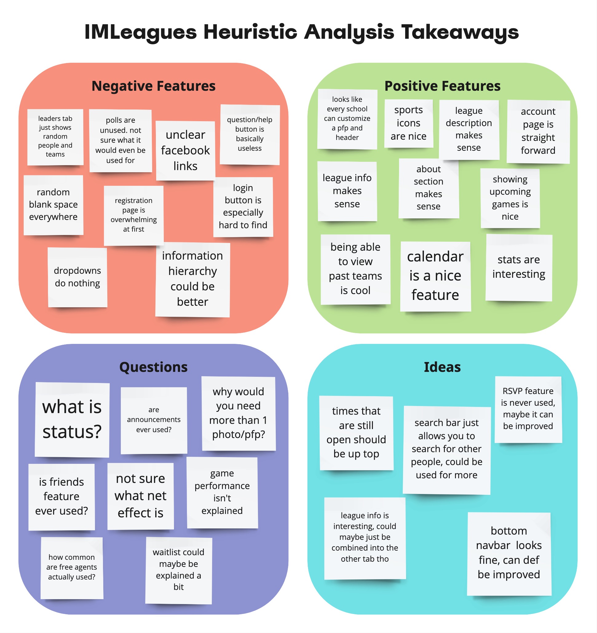
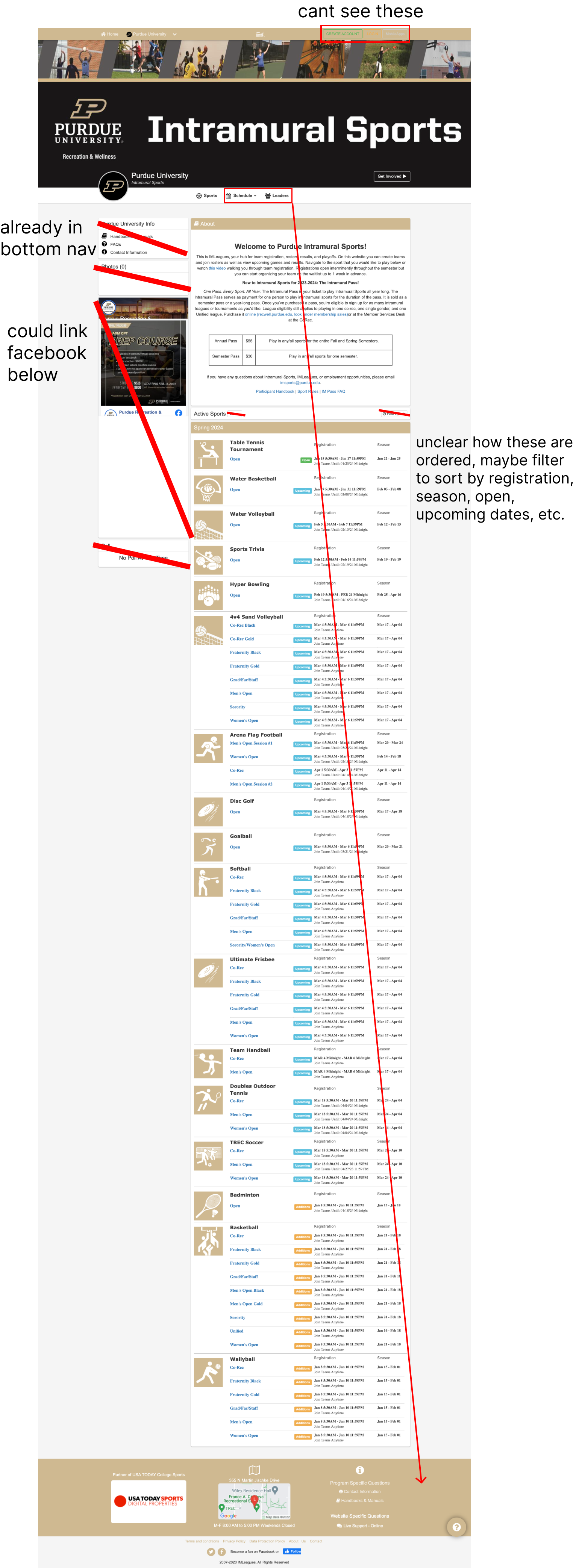
To organize and plan this project, I divided it into 3 milestones. The goal of the first milestone was to complete usability testing, based on research, to help begin to inform the redesign. To kickstart the project, I began with a heuristic evaluation to better understand the basic workings of the IMLeagues website. While I was already familiar with navigating the site, I took a step back to observe it from a wider perspective to gain more insights. I focused on aspects like content, layout, features, and UI, which helped me form some initial thoughts, shaping my future research.
Interviews & Surveys
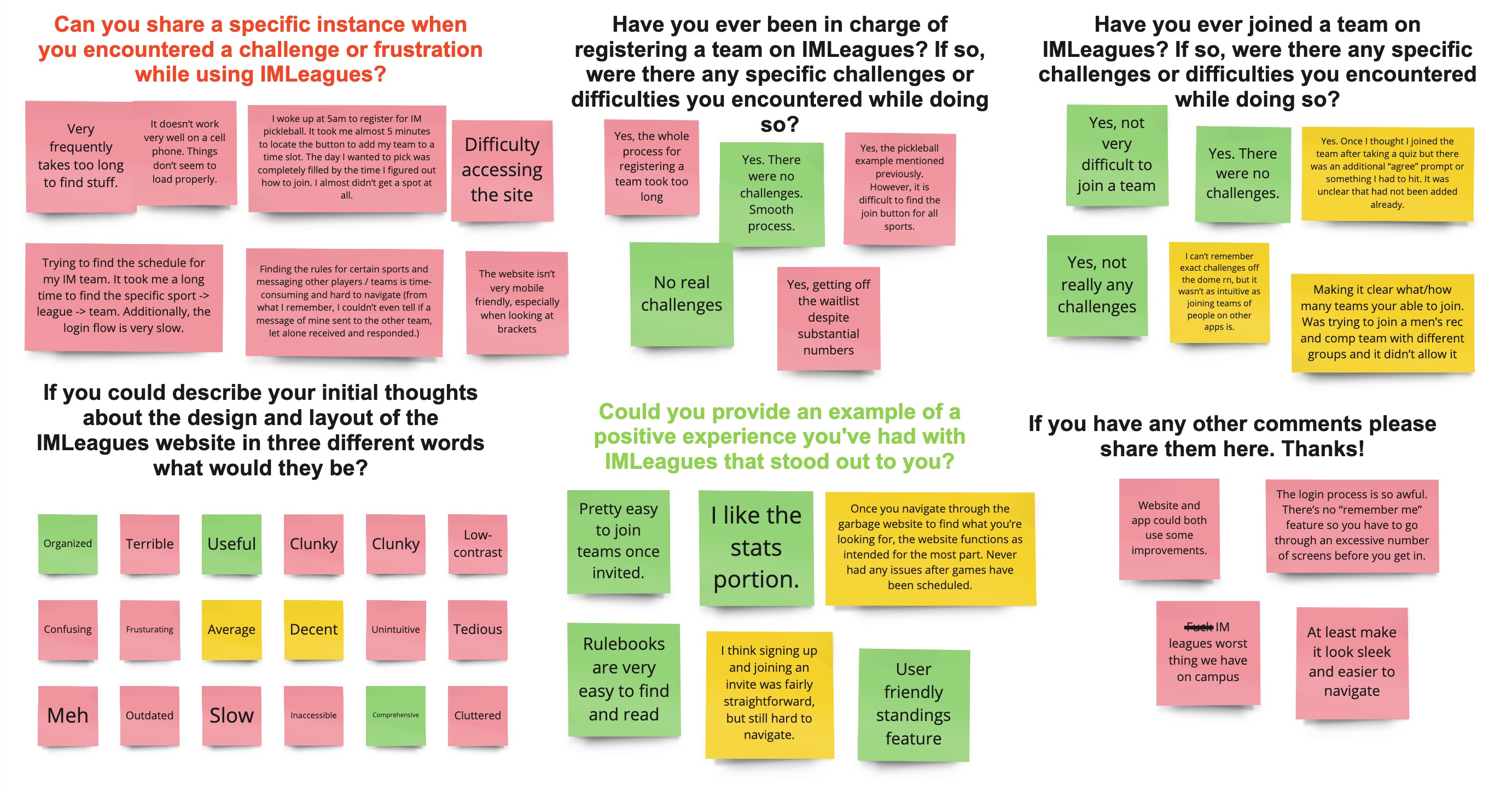
After conducting the heuristic evaluation, I had a much better understanding of the IMLeagues site as a whole. This helped inform the creation of my interview and survey protocol, where my main goal was to identify common pain points of users, and use those pain points to identify scenarios for usability testing. I sorted the responses on Miro to better visualize the insights, and I color coded responses into red, yellow, and green based on whether the comment was negative, neutral, or positive. Clearly, responses were overwhelmingly negative, which is good for me because there is a lot of room for improvement.
Usability Testing Round 1
Now that I knew what the most frustrating tasks were for IMLeagues users, I was able to create scenarios for usability testing. The purpose of these testing sessions was to collect quantitative and qualitative data on the usability and effectiveness of the current website, that I would then be able to compare to data collected from future testing sessions on my redesigned website. Ideally, my redesigned website will have significantly more positive data, which will indicate the effectiveness of my redesign. When creating my usability testing protocol, I had to determine what participant information would be helpful to collect, and what data/metrics would display the usability of the website. I decided to collect data on the duration each task took, errors made, assistance needed, participant rated difficulty and satisfaction levels, as well as adjectives to describe each task. My main takeaways from this round of testing was again, that people really don't like using IMLeagues, some adjectives used to describe tasks were slow, difficult, inefficient, tedious, confusing, vague, ugly, unintuitive, and many more. This testing also confirmed that the tasks I had determined as the biggest pain points were largely accurate, users emphasized how much of a hassle logging in is, even if it isn’t incredibly difficult, fighting out how to register for teams is a struggle, and finding rulebooks can be tough. Users did find it relatively easy to figure out how to message teammates, but even still, users still had to click through multiple screens and do some scrolling. Overall, there is a lot of room for improvement, and I look forward to round 2 of testing where, hopefully, I can prove the effectiveness of my redesign with improved data points.
Milestone 2: Finding a Clear Vision for the Redesign
Ideation
I had a couple of ideas for potential improvements for the website, so I wanted to do some basic ideation to keep track of my ideas. I created some annotated screenshots from the current website where I marked down certain features I felt were unnecessary or useless, as well as taking note of certain sections that could be moved or combined. My takeaways from this ideation session were that many features could probably be removed entirely, while more can be moved to make space for more useful features. Additionally, many pages can be combined to improve site navigation.
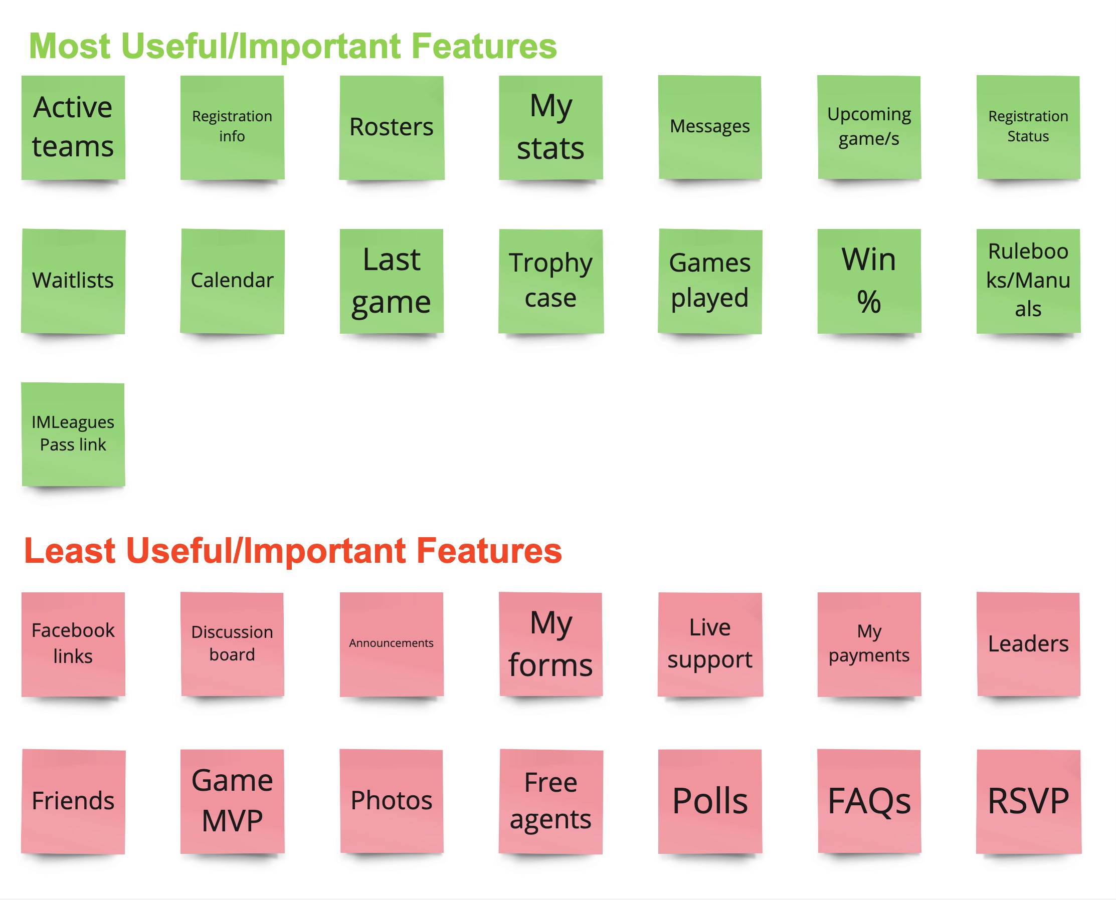
Card Sorting Workshop
I wanted to ensure that the users of the IMLeagues website were included in its redesign, so I decided to conduct a feature sorting activity. This workshop was conducted with four participants, all of varying experience using IMLeagues. These activities would help me further understand what features users felt were useful and important, which would inform my redesign by allowing me to remove useless features or make them less prevalent on the website. The feature sorting activity was super helpful in showing me features that I could completely remove, like polls, leaders, etc., it also showed me features that were only somewhat useful that I could display elsewhere on the site to reduce clutter. It also showed features that should be emphasized more than they currently are.
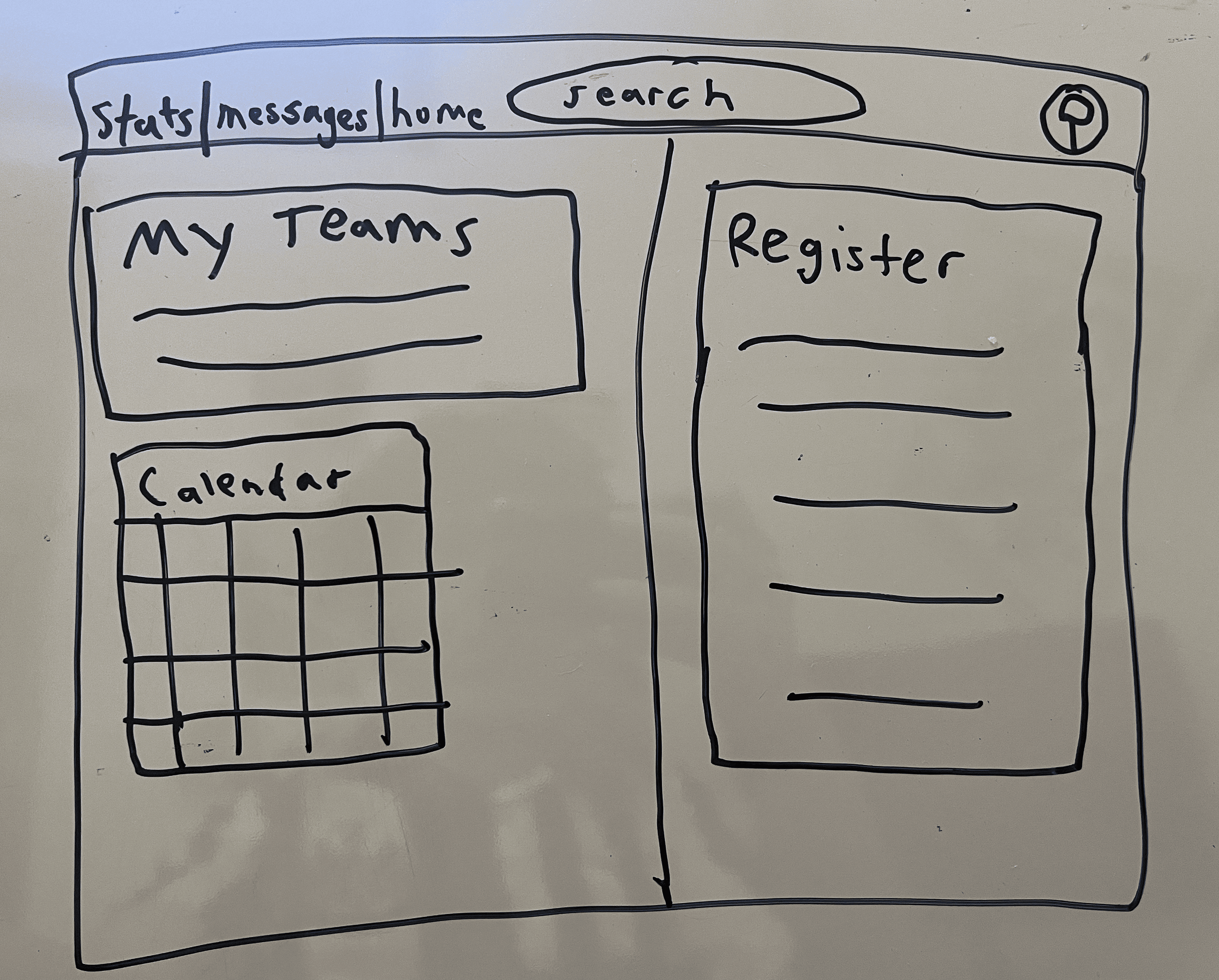
Whiteboarding Co-Design
I aimed for the whiteboarding co-design to allow me to get an idea of what users envisioned as an improved version of the site, even though the workshop participants weren’t designers, I felt this activity could be helpful for continued ideation. It ended up being great for giving me additional ideas, like combining certain pages, and continuing my understanding of what features users think are important. This exercise also helped to inform the above affinity diagram.
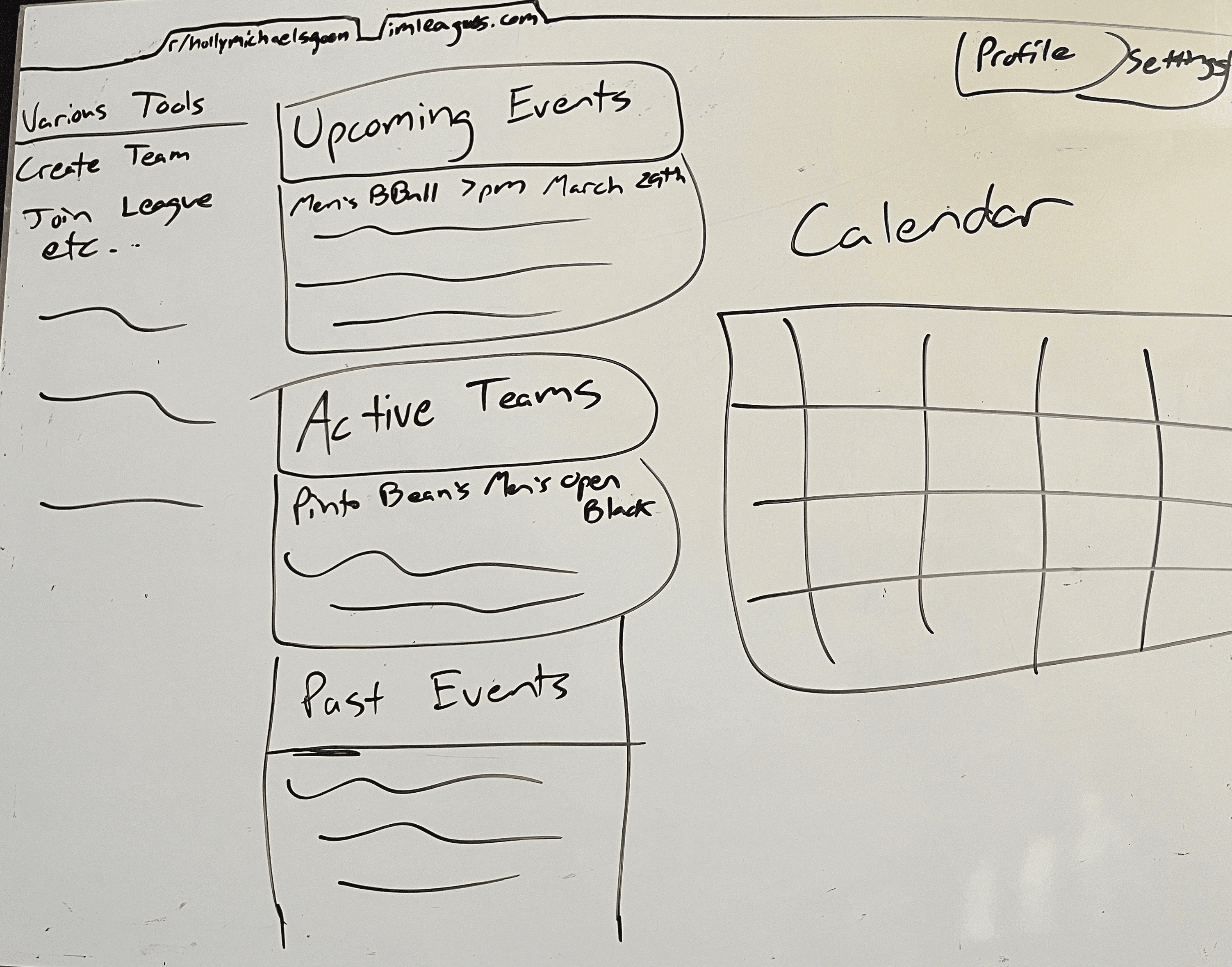
Sketching
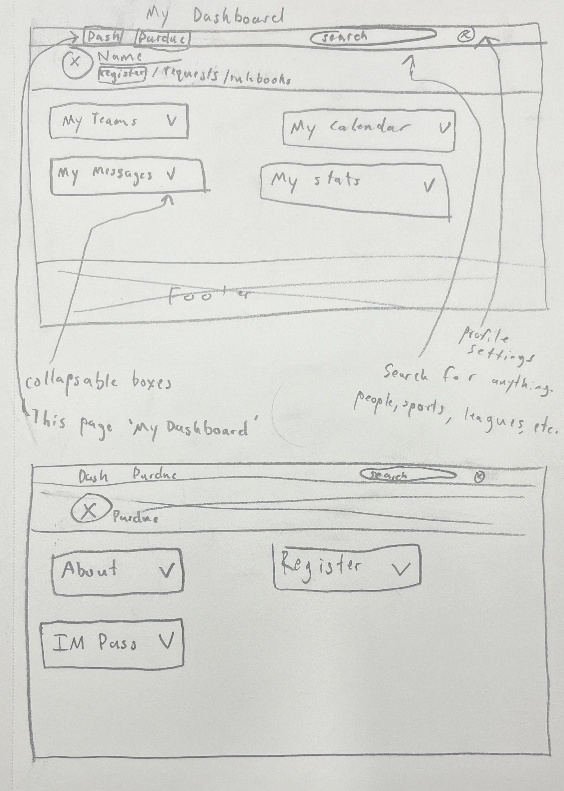
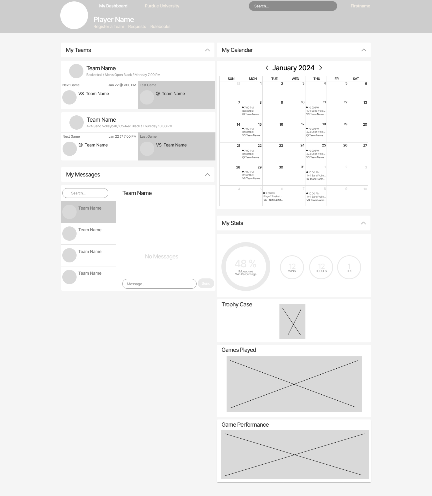
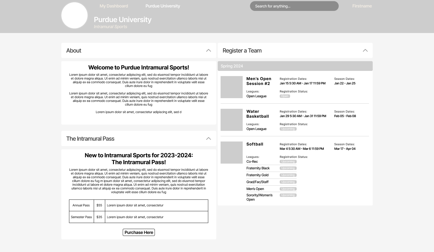
After the sketching co-design, I had some ideas for the redesign that I wanted to get out. I aimed to create a final sketch based on all previous research that I could use to begin prototyping. This sketch shows two main pages, a ‘My Dashboard’ page and ‘Purdue University’ page. The dashboard has all of the features and information that users want like team info, messages, calendar, and stats. This page is also more clear about where to click to register a team, and finding rulebooks. The Purdue University page has more information and features that users can see while logged in or out like basic information, the ability to easily purchase an IM pass, and team registration front and center. I also made each section have the ability to open and close so users can customize their pages based on what they think is useful to them.
Milestone 3: Building an MVP and Testing
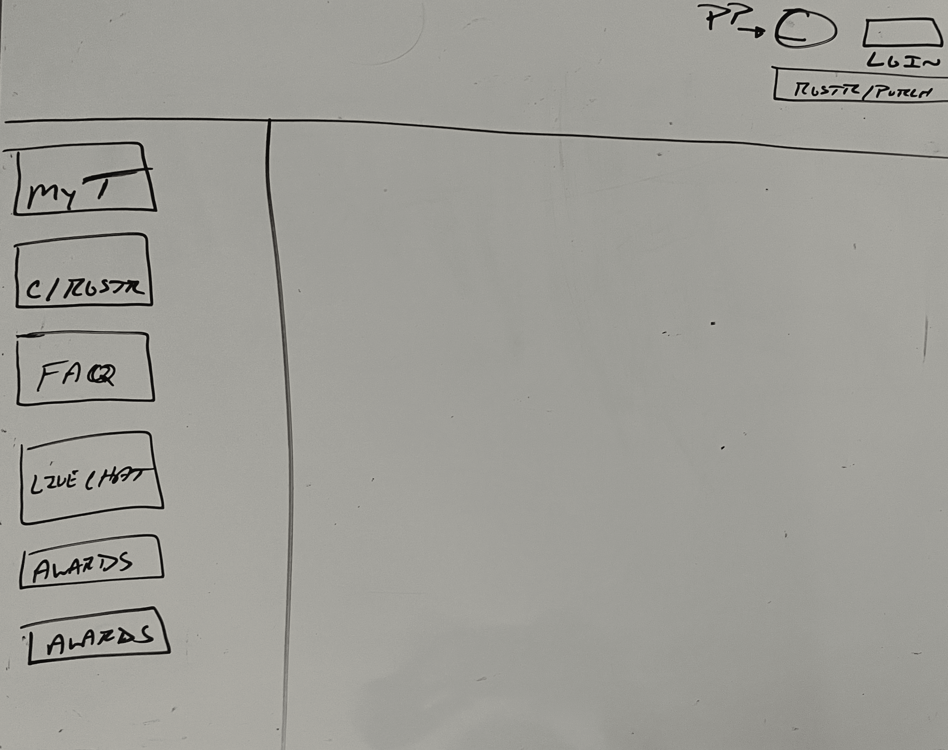
Lo-Fi Prototyping
I wanted to take my sketches into low-fidelity so that I could do some basic concept testing with the flow I was imagining as well as to get some more feedback about the layout of my design. These prototypes are an expanded version of my previous sketches, it’s still two pages, ‘My Dashboard’ and ‘Purdue University’ where users can easily switch between the two, while being able to access the most important information and features easily.
Concept Testing
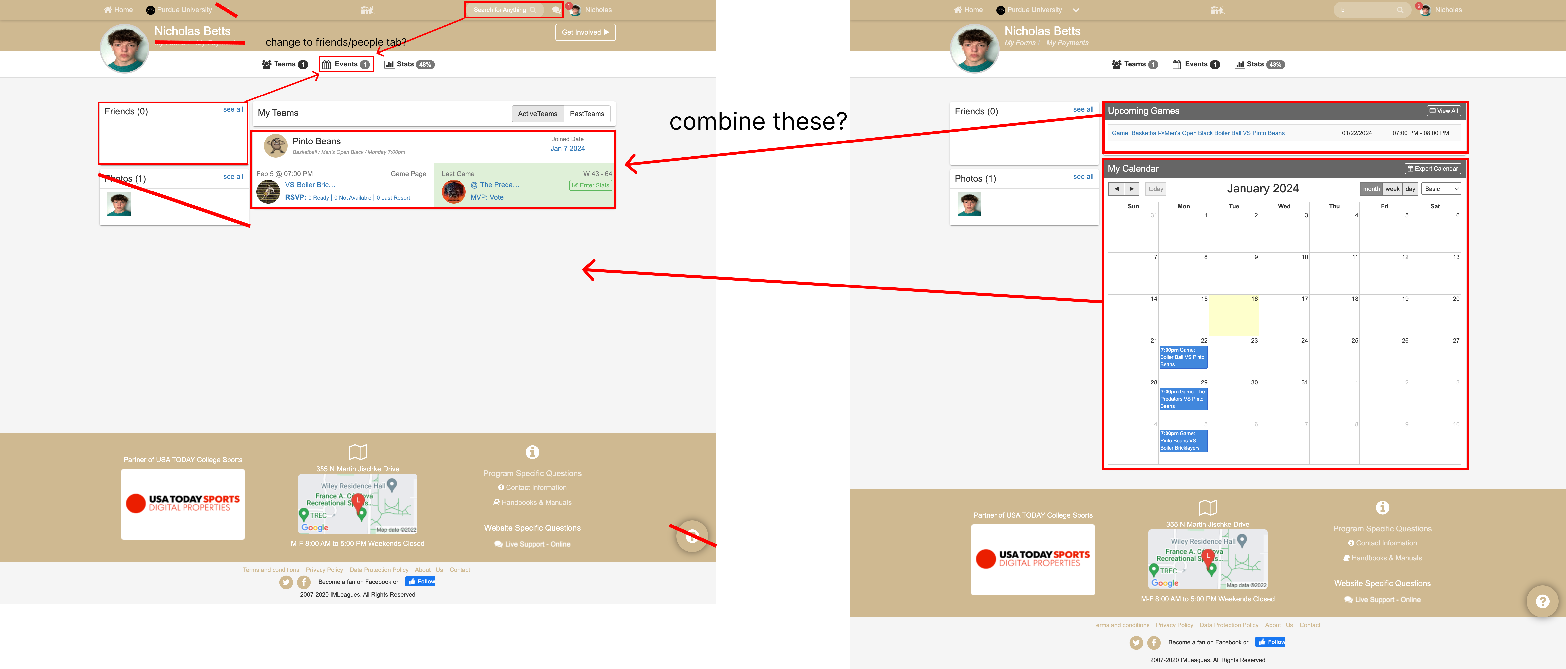
After some basic concept testing with my prototypes, it solidified my ideas about the flow of the pages, and my ideas about what features users would most want front and center. With this confidence, I felt good going into higher fidelity. I did learn that there was some information I needed to add, like more info in the ‘My Teams’ section. I also needed to improve the information hierarchy a bit as well, but a lot of that comes with color too.
Hi-Fi Prototyping
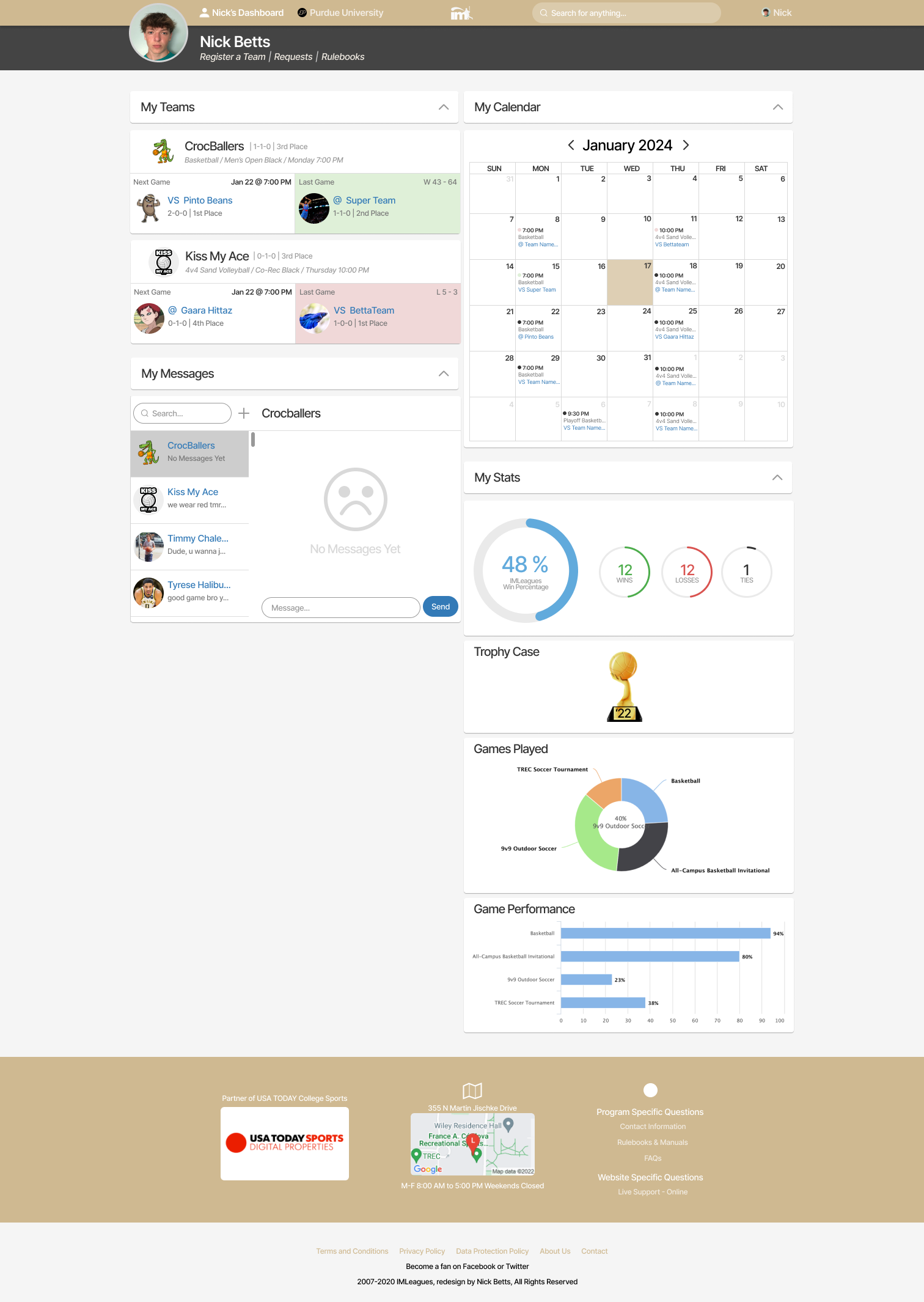
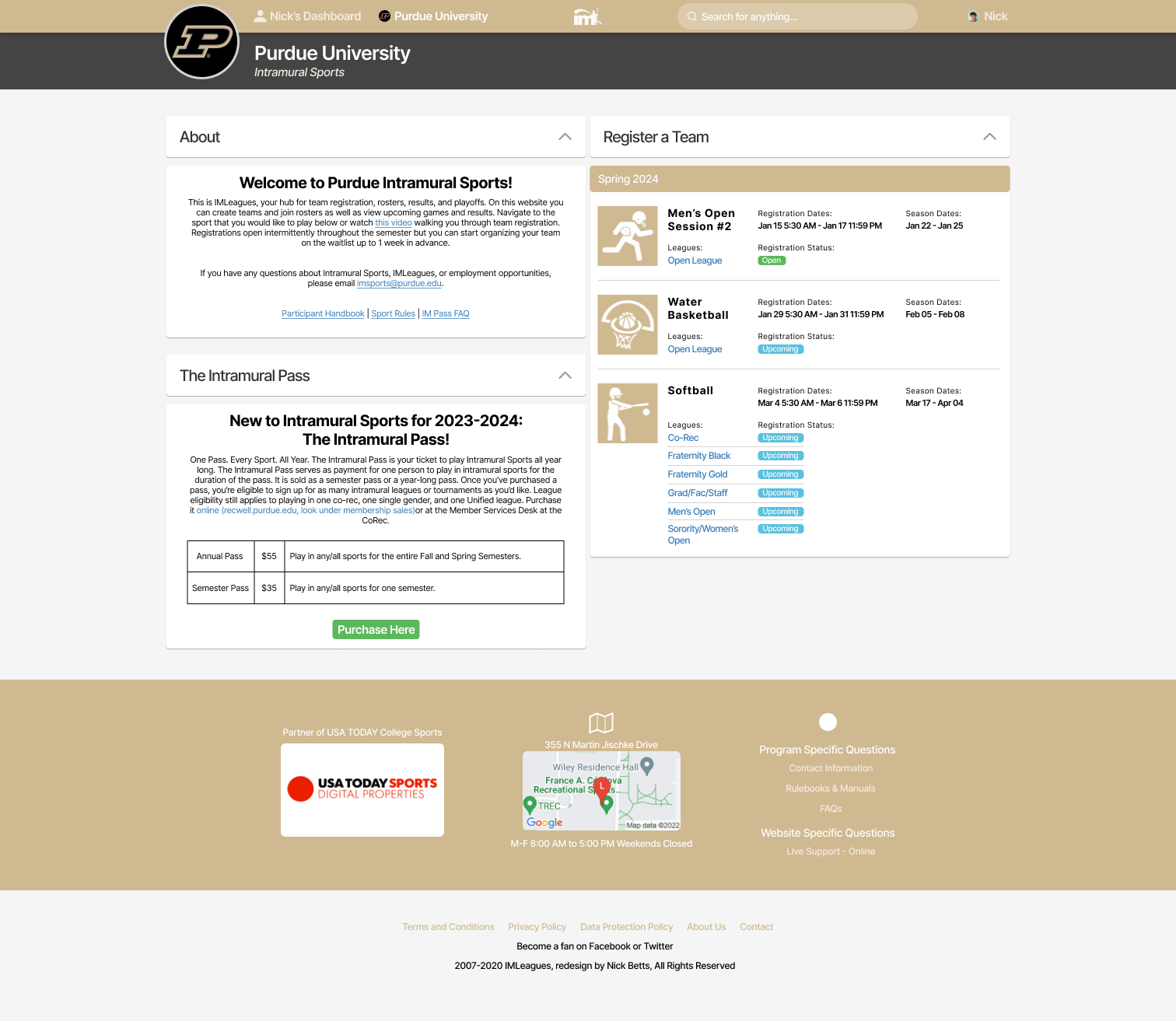
After concept testing, I was able to confidently move into high-fidelity designs. Since the structure and flow was already finalized, I mostly just had to touch up certain areas, add more detail and information, and color. In these hi-fis it’s still split up into ‘My Dashboard’ and ‘Purdue University’. The dashboard page features your active teams and displays previous and upcoming games, as well as your team's record, and place in the league. There is also a messaging section where you can easily send and view messages sent by teams and friends. I updated the calendar feature to display all previous and upcoming games for added confirmation of game dates and times. The final section is the stats are where users can view win percentages, trophies, games played, and gamer performance. I found during workshopping that users really liked looking at their stats. Lastly, on the top part of the dashboard, users have direct links to register a team, view requests, and find rulebooks.
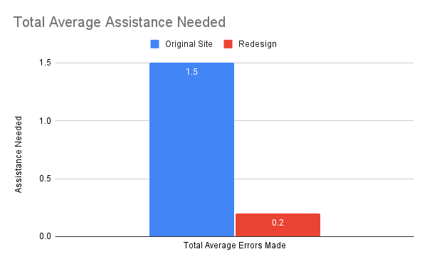
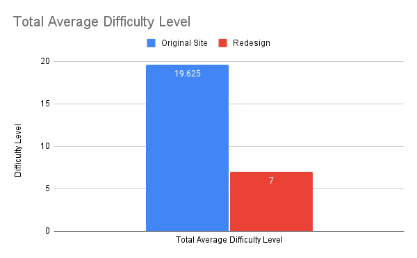
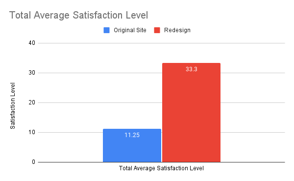
Usability Testing Round 2
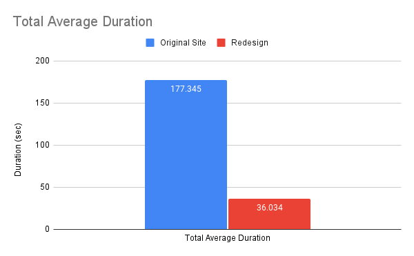
Once I had my hi-fi designs completed and prototyped, I was ready to begin my second round of testing. This was the biggest goal of the whole project, being able to prove with quantitative and qualitative data that my redesign was effective in solving common user pain points. I conducted round 2 of usability testing with the same four participants I had previously tested with, as well as one new participant to get data from a fresh perspective. Ideally, I would’ve been able to test with more new participants, but I wasn’t able to due to scheduling difficulty time constraints. Clearly, from the data visualizations we can see that my redesign was effective in reducing task duration, errors made, assistance needed, and difficulty level, as well as increasing satisfaction level. From the word cloud we can see the difference between round 1 and round 2, round 2 being overwhelmingly positive adjectives compared to overwhelmingly negative adjectives in round 1.
These are the percent average increase or decrease of data points from round 1 (original IMLeagues website) compared to round 2 (redesigned IMLeagues website) of testing.
Task 1: Logging In
Duration: 78.9533% decrease
Errors Made: 100% decrease
Assistance Needed: 100% decrease
Difficulty Level (1-10): 63.0769% decrease
Satisfaction Level (1-10): 242.222% increase
Task 2: Registering a Team
Duration: 79.0123% decrease
Errors Made: 100% decrease
Assistance Needed: 60% decrease
Difficulty Level (1-10): 56.9231% decrease
Satisfaction Level (1-10): 290% increase
Task 3: Finding Rulebooks
Duration: 78.9113% decrease
Errors Made: 80% decrease
Assistance Needed: 100% decrease
Difficulty Level (1-10): 75.6522% decrease
Satisfaction Level (1-10): 325% increase
Task 4: Messaging Teammates
Duration: 84.7741% decrease
Errors Made: 100% decrease
Assistance Needed: Same
Difficulty Level (1-10): 60% decrease
Satisfaction Level (1-10): 86% increase
All Tasks Average
Duration: 79.6814% decrease
Errors Made: 95.2941% decrease
Assistance Needed: 86.6667% decrease
Difficulty Level (1-10): 64.3312% decrease
Satisfaction Level (1-10): 196% increase
Reflection
I'm very proud of this project. I did exactly what I set out to do by creating final designs that look good, and I was able to collect a ton of data that proved the effectiveness of my redesign. Prior to this project, I hadn't really worked on such an expansive solo project. However, the challenges presented have been invaluable, solidifying my confidence in my UX skills, as well as my project management skills. Creating my own project plan and planning out my activities and when I would do them was a useful task and I’m proud that I was able to stay on track and that most of the tasks I thought I would need to do, I actually needed to do. As I reflect on my accomplishments, I realize that this project has served as a validating confirmation of my expertise in UX design. Moreover, this experience has equipped me with invaluable insights and skills that will undoubtedly serve me well in future projects, upcoming internships, and eventual transition to a full-time role. Through collaborating with stakeholders on my project, I've honed my ability to navigate complex dynamics and ensure that my solutions are not only effective but also deeply informed by stakeholder input. This newfound confidence and proficiency are sure to propel me forward with assurance and readiness for the challenges that lie ahead.


.png)